A trading card looks like nothing more than a printed rectangle, but it is a surprisingly engineered object. The stock, the core, the surface texture, and the coating together decide how the card feels in the hand, whether an opponent can read it through the back, how it survives a thousand shuffles, and how premium it looks under the light. Understanding those layers is what separates a card set that feels professional from one that feels like a printout. Here is what each specification actually controls.
Start with the standard size and its margins
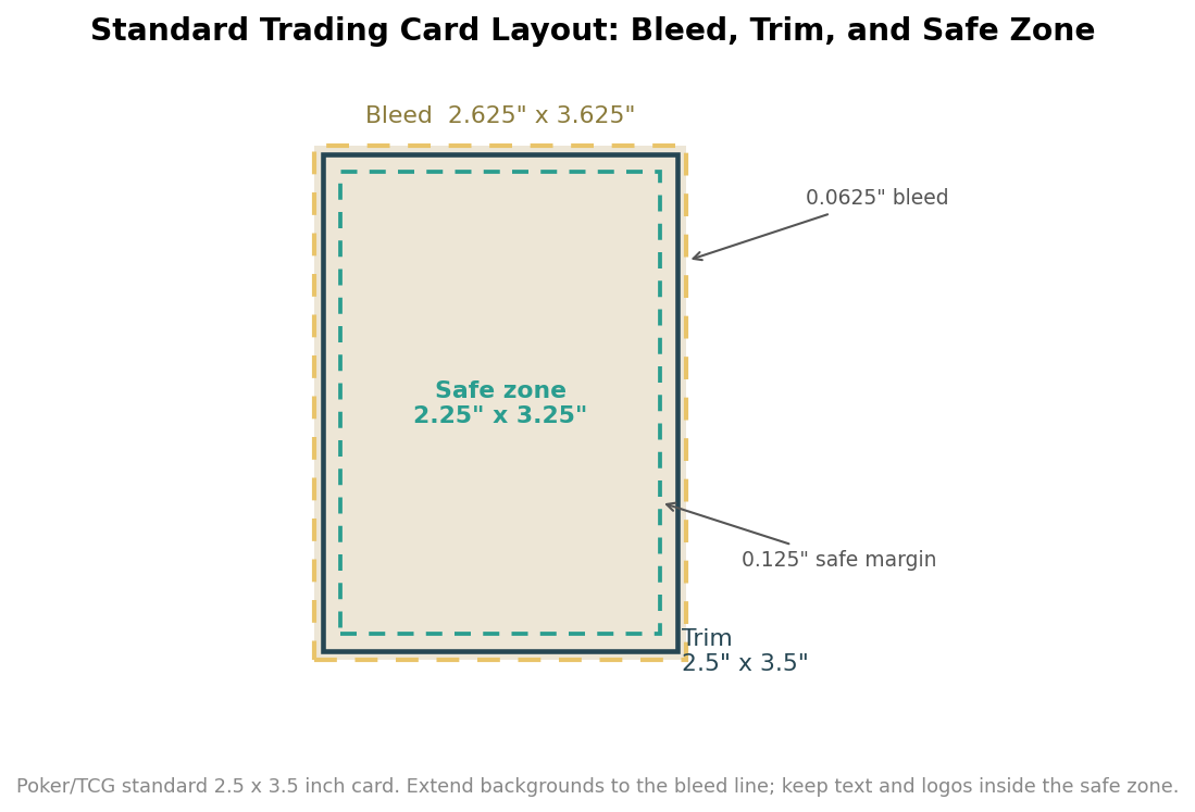
Almost every collectible and gaming card follows the poker standard of 2.5 by 3.5 inches, which is why sleeves, deck boxes, and binder pages are built around it. What trips up first-time designers is not the trim size but the two margins around it. You extend any background art past the trim to a bleed of about 0.0625 inches on each edge, so that a slight shift on the cutter never leaves a white sliver. Working inward, you keep every important element, text, logos, stat boxes, at least 0.125 inches inside the trim in the safe zone, because that same cutting tolerance can shave the edge. Corners are then rounded, typically to a radius in the three to four millimeter range, which is both the classic look and the reason cards resist dog-earing.
The core is what stops opponents seeing through the back
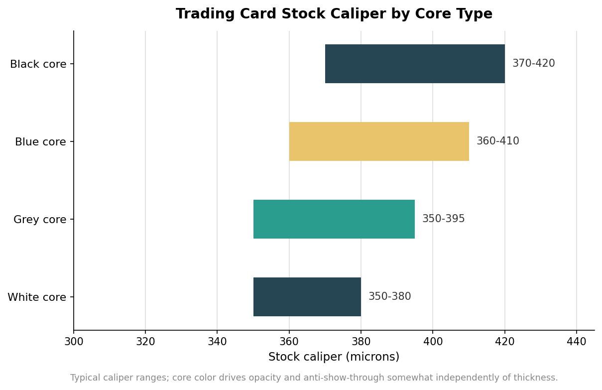
Inside the stock sits a hidden layer that matters more than any other for gameplay: the core. It is a dark or tinted sheet laminated between the two printed faces, and its job is opacity. A black core delivers the maximum anti-show-through and is the standard for tournament trading card games, poker, and casino decks where a readable back would be a fairness problem. A blue core gives balanced opacity with crisp handling and suits mainstream board games and learning cards. A grey core is the cost-oriented option for entry-level and promotional decks. Weight tracks roughly with quality: black-core stocks commonly run 310 to 350 gsm, blue cores span 280 to 330 gsm, and the resulting caliper, or thickness, lands in the region of 350 to 420 microns depending on core and weight. Thickness also affects how a card sleeves and how a full deck sits in a box, so if you are matching an existing set or a specific sleeve, confirm the caliper and not just the gsm.
Smooth or linen: the texture you actually shuffle
Texture is a separate decision from stock, and it is the one players feel first. A smooth finish gives the crispest print and a clean, professional handling that photographs well, which makes it common for collectible and display cards. A linen or embossed finish presses a fine texture into the surface that creates tiny air pockets between stacked cards, improving airflow so they do not stick and glide apart cleanly during a shuffle. For a deck that gets played hard and often, that linen texture is not a cosmetic upgrade; it is the difference between a deck that fans smoothly and one that clumps.
Coatings decide glare, grip, and fingerprints
On top of the texture goes a coating, and each trades one virtue for another. Gloss lamination makes colors pop and adds water resistance, at the cost of reflective glare and visible fingerprints, so it flatters color-heavy art meant to be admired more than handled. Matte lamination cuts glare, hides fingerprints, and reads more sophisticated, with colors that appear slightly softer, and it shuffles comfortably. Soft-touch lamination adds a velvet-like premium feel but scratches more easily and is a poor match for heavy play. At the budget end, a simple varnish offers basic protection without the durability of true lamination. For a gameplay-first product, the reliable combination is a linen texture under matte lamination; for a budget promotional run, varnish keeps the cost down. It is worth deciding this before you finalize art, because a design tuned for glossy vibrancy can look flat under matte, and one built for matte subtlety can look garish under gloss.
Foil, holographic, and edges for the chase cards
The premium tier is where cards stop being printed and start being finished. Spot UV lays a selective high-gloss coating over chosen elements, a logo or a border, so it catches light against a matte background. Foil stamping presses metallic material into the surface for a mirror-bright accent, and full holographic stock refracts a rainbow shimmer across the whole face for the rare or chase cards that drive a set. Gilded or foil edges finish the stack itself. These effects add genuine perceived value, but each is a separate production step with its own setup, so they are best reserved for the small subset of cards meant to feel special rather than applied across an entire common run. Deck sizes themselves are flexible, commonly configurable anywhere from around 18 up to a few hundred cards, and small art changes on tiny quantities sometimes carry a modest setup fee.
Specifying a card that feels right
Put the layers together in order and the decision becomes simple. Design to the 2.5 by 3.5 inch trim with proper bleed and safe margins, choose a black core when opacity and fairness matter and a lighter core when they do not, pick a linen texture for decks that get shuffled and smooth for cards that get displayed, coat with matte for play and gloss for show, and save foil and holographic effects for the handful of cards that earn them. Specified that way, an ordinary rectangle of card becomes something people keep.